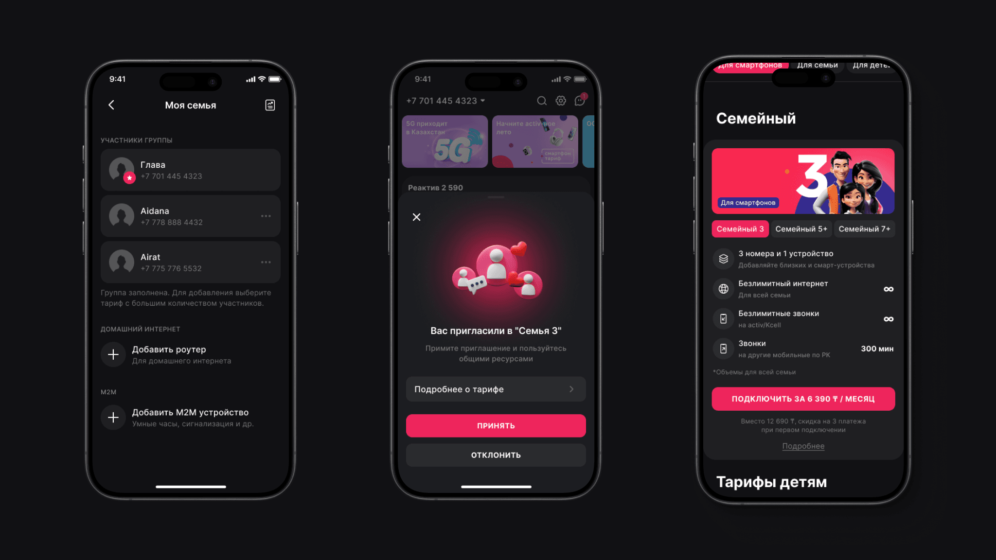
Kcell - App Marketplace
2023-2024, Product Design
As part of the SuperApp development, I redesigned the app marketplace section to simplify user interaction with subscriptions. The update made subscription costs more transparent, reduced the steps required to activate services, and streamlined the flow for connecting Yandex subscription for Kcell users.

Case 1
Problem
The layout of services was unclear and unpredictable, making it difficult for users to understand the purpose and placement of different offerings.
Solution
Redesigned the services layout into a list format with clear titles and descriptions, and added category-based filtering for easier navigation.


Case 2
Problem
Service cards with subscriptions lacked transparency: to see how many subscriptions were available inside a mini-app, users had to open the card.
Solution
Reworked mini-app cards by surfacing the list of available services and enabling one-click subscription directly from the card.
Result
Users gained a clear overview of available subscriptions and could activate them faster without unnecessary steps.

Offers card
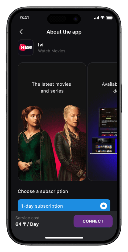
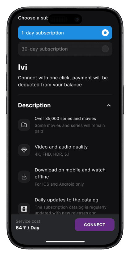
Each card displays different pricing models highlights special deals, and provides clear entry points to connect or learn more. This approach simplifies decision-making, increases transparency, and helps drive conversions by reducing friction in choosing the right plan.

Subscription Flow
Users can quickly compare subscription options, view key service details, and connect with a single tap, making plan selection simple and transparent.
Case 3
Problem
Activation flows for third-party apps were cumbersome. For example, to activate a Yandex Plus subscription, users had to return to the main page widget and press the activation button, creating friction and lowering conversion.
Solution
Result
Conversion of Yandex Plus activations increased significantly - by 80%.

Yandex subscription
One of the key challenges was the activation of semi-automatic services, which disrupted the user experience. In the case of Yandex subscription, users had to confirm activation on the Yandex side, but the old design did not provide a clear entry point. As a result, most users reported issues with “inactive subscriptions.” I proposed adding an explicit activation button at the final step of the flow, which increased successful activations by 80% and significantly reduced support requests.
End of cases
Faster transactions - reduced time to complete payments, transfers, and top-ups.
The redesign reduced the number of steps required to activate subscriptions, simplifying the flow and increasing activation conversion.
Yandex connections increased after the activation flow was redesigned. Previously, the flow was placed as a separate widget on the homepage. Since the homepage was overloaded with content, the cognitive load was high, and users often overlooked the widget.