Higgsfield

2025

Test Assignment

Test Assignment

As part of the hiring process at Higgsfield,
I completed a design test task focused on improving the product experience. The assignment was aimed at evaluating my ability to balance usability, aesthetics, and clear workflows within a short timeframe.

image-0

Hero block

Hero block

Cinematic, large-scale videos in the hero section preserve the original wow-effect of the website. At the same time, the redesign significantly reduces cognitive load by shifting the focus toward more detailed, story-driven video content. This balance between strong visual impact and improved clarity ensures that users stay impressed without feeling overwhelmed.

Cinematic, large-scale videos in the hero section preserve the original wow-effect of the website. At the same time, the redesign significantly reduces cognitive load by shifting the focus toward more detailed, story-driven video content. This balance between strong visual impact and improved clarity ensures that users stay impressed without feeling overwhelmed.

image-0

Reference block

Reference block

I redesigned the Masonry reference block showcasing Higgsfield’s AI models. The main goal was to unify the browsing experience and make it easier for users to explore different model implementations without scrolling through the entire page.


Instead of displaying all categories at once, I introduced filters that allow users to switch between models and add-ons seamlessly. The content area now updates only in the lower section of the block, keeping the overall layout stable and reducing visual noise.


To simplify navigation further, I reduced the number of subcategories by highlighting the most popular ones. For deeper exploration, users can switch to the full library via an “All Effects” button. This approach combines clarity and scalability, making it easier for users to discover and compare AI model outputs.

I redesigned the Masonry reference block showcasing Higgsfield’s AI models. The main goal was to unify the browsing experience and make it easier for users to explore different model implementations without scrolling through the entire page.


Instead of displaying all categories at once, I introduced filters that allow users to switch between models and add-ons seamlessly. The content area now updates only in the lower section of the block, keeping the overall layout stable and reducing visual noise.


To simplify navigation further, I reduced the number of subcategories by highlighting the most popular ones. For deeper exploration, users can switch to the full library via an “All Effects” button. This approach combines clarity and scalability, making it easier for users to discover and compare AI model outputs.

image-0

Higgsfield Apps

For the launch of Higgsfield Apps, I created a distinctive call-to-action block instead of duplicating the existing effects and mini-app sections. The goal was to build a stronger visual anchor that immediately communicates the value of the new product.

The block features animated visuals paired with bold, contextual messaging such as “one click,” “ready-to-share,” and “no editing.” This approach not only grabs user attention but also reinforces the app’s core promise of effortless, instant content creation.

By merging clarity with dynamic motion, the CTA block stands out as a unique touchpoint that drives engagement and conversions.
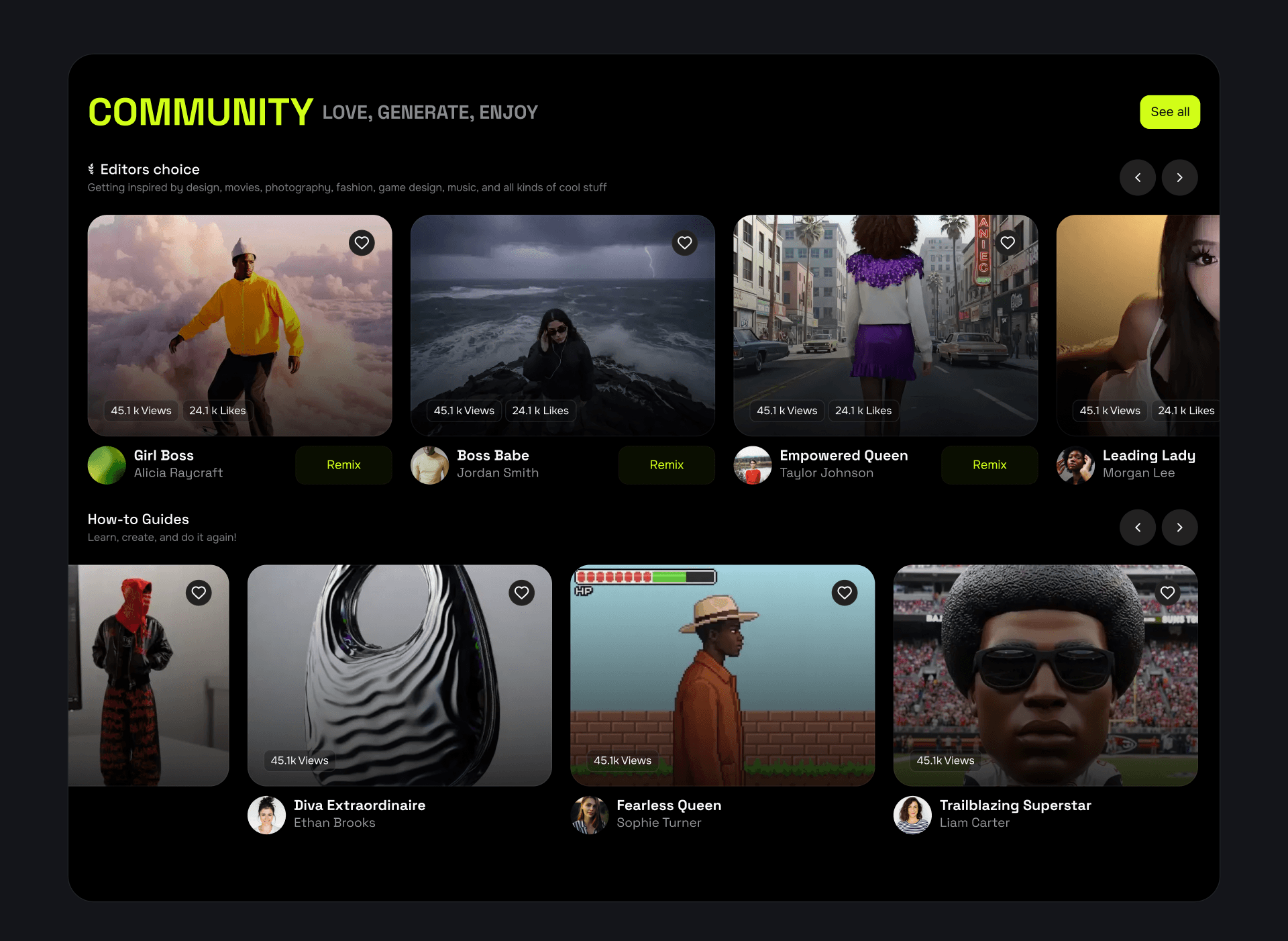
image-0

Community section

I redesigned the Community section to make it more structured, engaging, and fair for all contributors. The content is now divided into two clear categories: Editor’s Choice and Tutorials, giving users distinct ways to explore community-driven content.

To support interaction and creativity, I added views and likes counters, and introduced a “Remix” button in the Editor’s Choice block, encouraging users to build on featured works. A “See All” button now leads to a dedicated community page for deeper exploration.

All cards were standardized to the same size, ensuring equal visibility for every creator on the homepage and preventing confusion between the Effects and Community sections. This redesign balances fair exposure, clarity, and engagement, fostering stronger community participation.
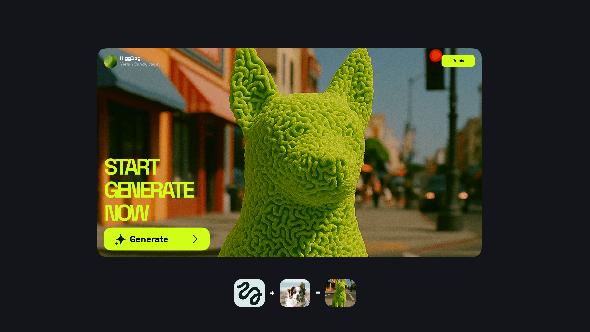
image-0

CTA-Block

I designed an additional call-to-action section supported by a custom mascot that draws directly from Higgsfield’s visual identity.

The mascot — a dog built from the same “lines” as the logo — was conceived as if it materialized from the Higgs field itself. This is a deliberate reference to physics: particles gain mass from the Higgs field, and here the dog emerges as a playful embodiment of that concept.

Using a dog as a symbol of loyalty and trust creates a striking contrast to the complexity of cutting-edge AI technology. This balance of science-inspired visuals and emotional storytelling makes the brand feel both credible and approachable, while giving the CTA block a unique character.

image-0

Models section

I also introduced a dedicated block for AI models, presenting them as standalone modules. This approach emphasizes their independence and highlights the flexibility of using each model as an individual tool for different tasks.

image-0

Footer

In the footer, I added a subtle easter egg to strengthen brand personality. Instead of the conventional @ symbol in the email address, I replaced it with the dog mascot — playing on the fact that “@” is commonly called “at” or even “dog” in some languages.

Next projects

App market
App market
2023-2025
Redesign
inDrive
2025
Initiative work
App market
App market
2023-2025
Redesign
inDrive
2025
Initiative work

Yerlan Sandybayev

Product Designer

© Made by me / Yerlan Sandybayev 2025 - Now

Yerlan Sandybayev

Product Designer

© Made by me / Yerlan Sandybayev 2025 - Now

Yerlan Sandybayev

Product Designer

© Made by me /
Yerlan Sandybayev 2025-Now

Create a free website with Framer, the website builder loved by startups, designers and agencies.